
Steam Store Redesign
Personal case study on the Store section of the video game platform, Steam.
ROLE
UX Designer
TEAM
Solo Case Study
TOOLS
Adobe Xd
Photoshop
Google Suite
TIMELINE
Feb - Mar 2021
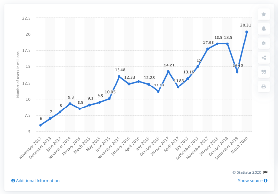
NEW PLAYERS EVERY YEAR
The number of worldwide players has been steadily growing from 2.03 billion in 2015 to 2.81 billion in 2020. New users get interested in video games each year.
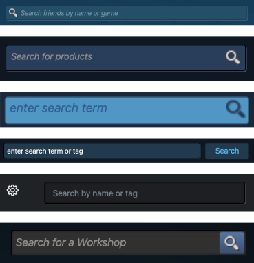
Example of design inconsistencies uncovered: the design of the search bar is very inconsistent throughout the app.
UNDERSTANDING THE PROBLEM
The Steam app has a tremendous amount of content. To familiarize myself, I conducted a competitive analysis, a content audit and I reproduced a sitemap of the current Store section.
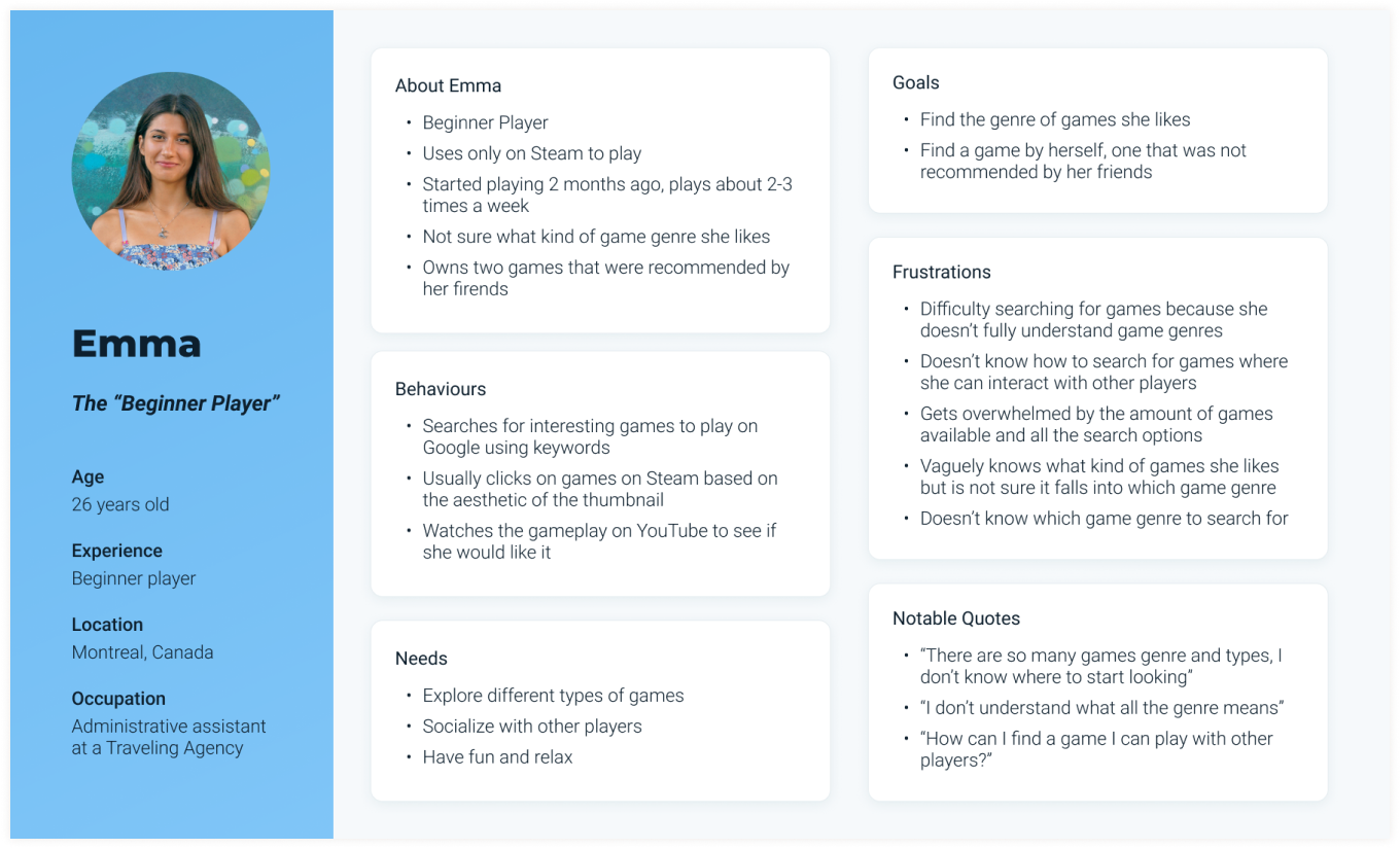
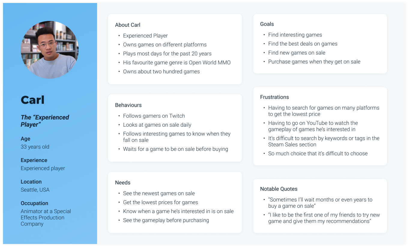
USERS EXPERIENCE LEVEL
I conducted a survey and user interviews with steam users of different experience levels.
I organized the findings using affinity mapping and extracted trends and insights from it.

Beginner User
- Difficulty navigating the cluttered interface
- Confused by game genres
- Rely on friends for new game ideas
Experienced User
- Want to see game genre tags
- Rely on other player’s reviews and satisfaction
- Look for games in Sales
DISPLAYING INFORMATION
As I designed my low-fidelity wireframes, I wondered which type of filters would work best.
I found a study conducted by the Baynard Institute that states that horizontal filter bar significantly outperforms the left-side one in terms of convenience and efficiency.
The study also mentioned that a horizontal layout works best when you have less categories, which would be a problem for an app like Steam since it has so many filters.
Both prototypes performed well, but there was a preference for the left-sided filters.
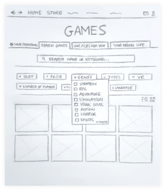
Low-fidelity wireframe with horizontal filters
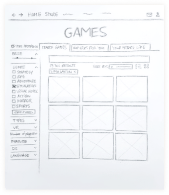
Low-fidelity wireframe with left-sided filters, which was was the preferred option of users
USABILITY TESTING
The participants started on the Home Page and had to reach the Store and search for different game genres. Afterwards, I organized the information collected in a rainbow spreadsheet.
FINAL DESIGN
*All illustrations made by me except the icons
WHAT I LEARNED
- Keep my focus on the task. Sometimes in your research you encounter issues with other elements of the product. It is important to take note of it but to stay focused on the problem you are trying to solve.
- Do not hesitate to look at previous research done on the subject, it can help you in your decision process.